CSS 垂直居中
- 显示方式设置成表格
html:1
2
3
4
5<div id="wrapper">
<div id="cell">
<div class="content">Content goes here.</div>
</div>
</div>
css:1
2
3
4
5
6
7
8
9#wrapper {
display: table;
height: 100px;
background: pink;
}
#cell {
display: table-cell;
vertical-align: middle;
}
效果: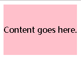
- 父元素相对定位,子元素绝对定位
html:1
2
3<div id="wrapper">
<div class="content">Content goes here.</div>
</div>
css:1
2
3
4
5
6
7
8
9
10
11
12
13
14
15
16#wrapper {
border: 1px solid #ccc;
width: 600px;
height: 400px;
position: relative;
}
.content {
background: pink;
width: 300px;
height: 200px;
positioin: absolute;
left: 50%;
top: 50%;
margin-left: -150px;
margin-top: -100px;
}
效果:
- CSS3
transform代替margin
html:1
2
3<div id="wrapper">
<div class="content">Content goes here.</div>
</div>
css:1
2
3
4
5
6
7
8
9
10
11
12
13#wrapper {
border: 1px solid #ccc;
width: 600px;
height: 400px;
position: relative;
}
.content {
background: pink;
position: absolute;
left: 50%;
top: 50%;
transform: translate(-50%, -50%);
}
效果: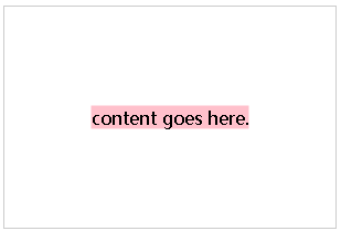
margin: auto实现
html:1
2
3<div id="wrapper">
<div class="content">Content goes here.</div>
</div>
css:1
2
3
4
5
6
7
8
9
10
11
12
13
14
15
16
17#wrapper {
border: 1px solid #ccc;
width: 600px;
height: 400px;
position: relative;
}
.content {
background: pink;
width: 200px;
height: 100px;
position: absolute;
left: 0;
top: 0;
right: 0;
bottom: 0;
margin: auto;
}
效果: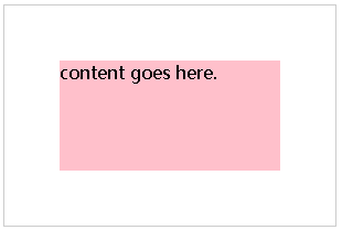
本文作者 : Xuebin Zhang
原文链接 : https://capping.github.io/2018/09/20/CSS-Vertical-Center/
版权声明 : 本博客所有文章除特别声明外,均采用 CC BY-NC-SA 4.0 许可协议。转载请注明出处!